Canvas Branding Dashboard
Overview
The Canvas branding dashboard aims to enable you to customise every visual detail of all the components present in the checkout page to make it look like a true extension of your own platform. This helps in instilling trust in customers regarding the authenticity of the checkout page and makes the visual transition from your platform to checkout much smoother.
How to customise the checkout page
Follow the instructions below to customise the checkout page from the dashboard:
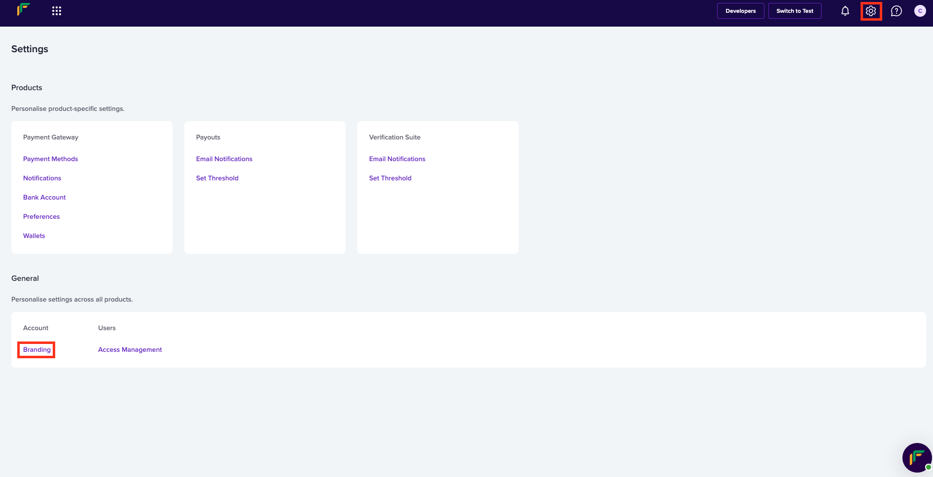
- Log in to the Cashfree Payments dashboard using your credentials.
- Navigate to Checkout One > Canvas from the Payment Gateway dashboard, or navigate to Settings > Branding.
Settings
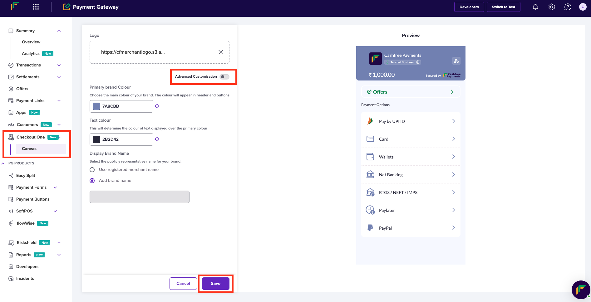
Payment Gateway Dashboard
- Customise the checkout page using the basic options, or click Advanced Configuration for more detailed customisation tailored to your specific needs.
- Click Save.
Read the following to understand the Basic and Advanced options that help you fulfil your business needs.
Basic configurations
Quick configuration option allows you to customise checkout with minimalist branding like adding their primary colour on checkout.
Configurations available:
- Logo
Logo is a graphic mark used for a company's identification.
- Primary Colour
It is the most prominent colour for a company's identity. Headers, icons, call to action (CTAs), and all the clickable elements on the checkout page will displays this colour.
- Text Colour
It defines the colour of the text used on the headers. Note that the text along with the colour will display over the header colour.
Basic
Advanced configurations
Detailed configuration option allows you to customise checkout to match the exact visual styling of their platform
Configurations available:
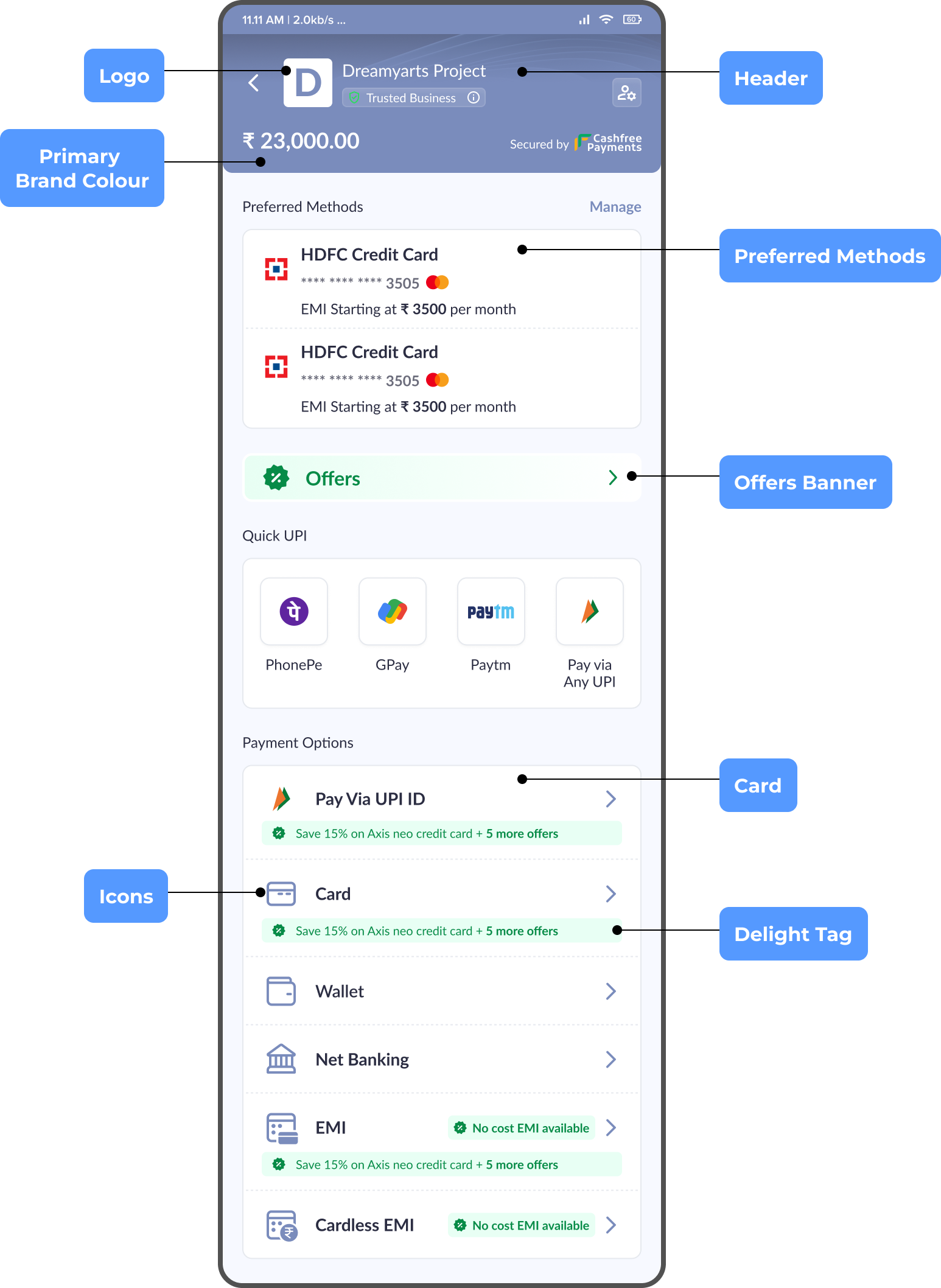
Layout and Typography
You can configure the following options:
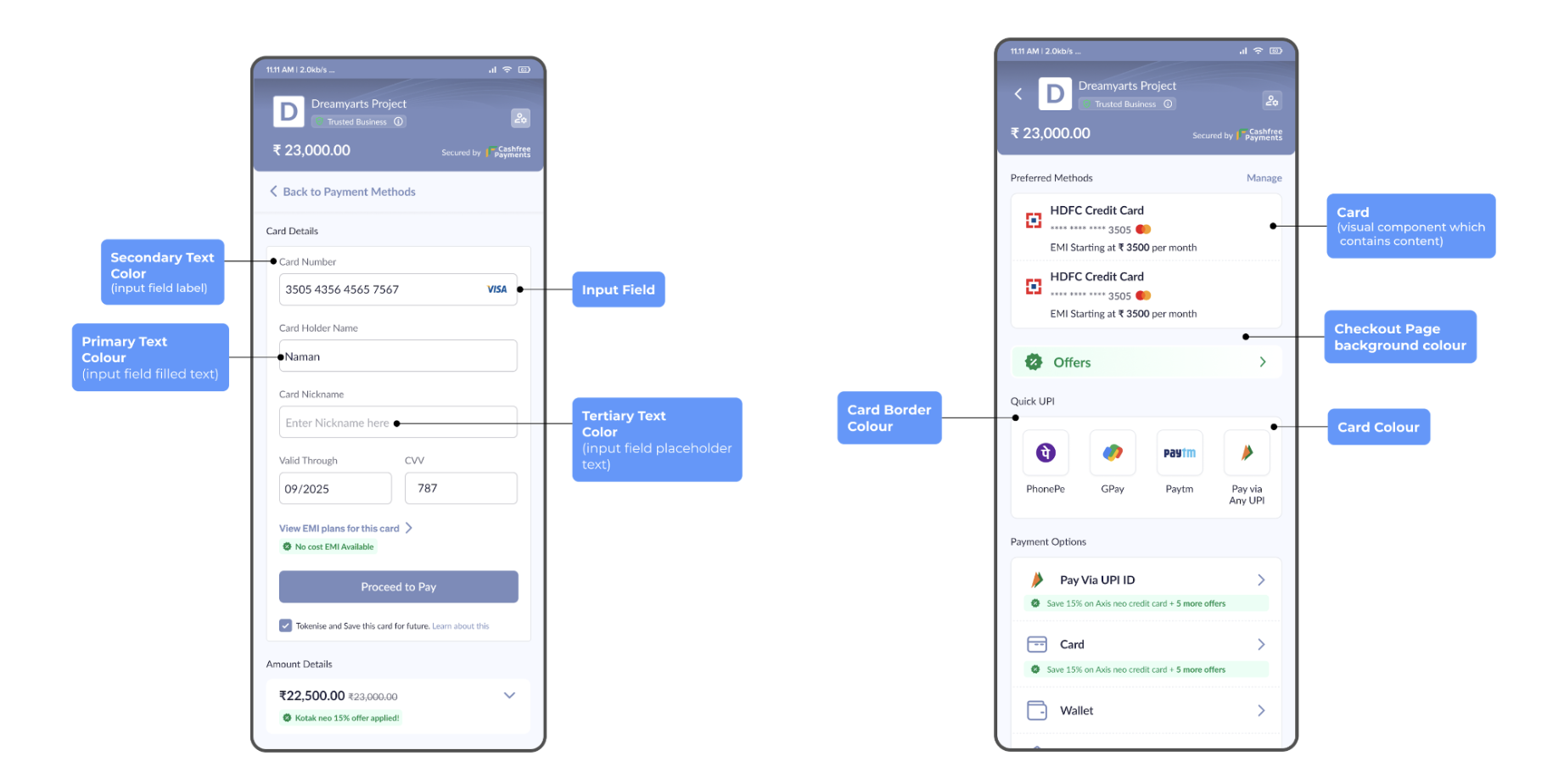
- Checkout page background colour
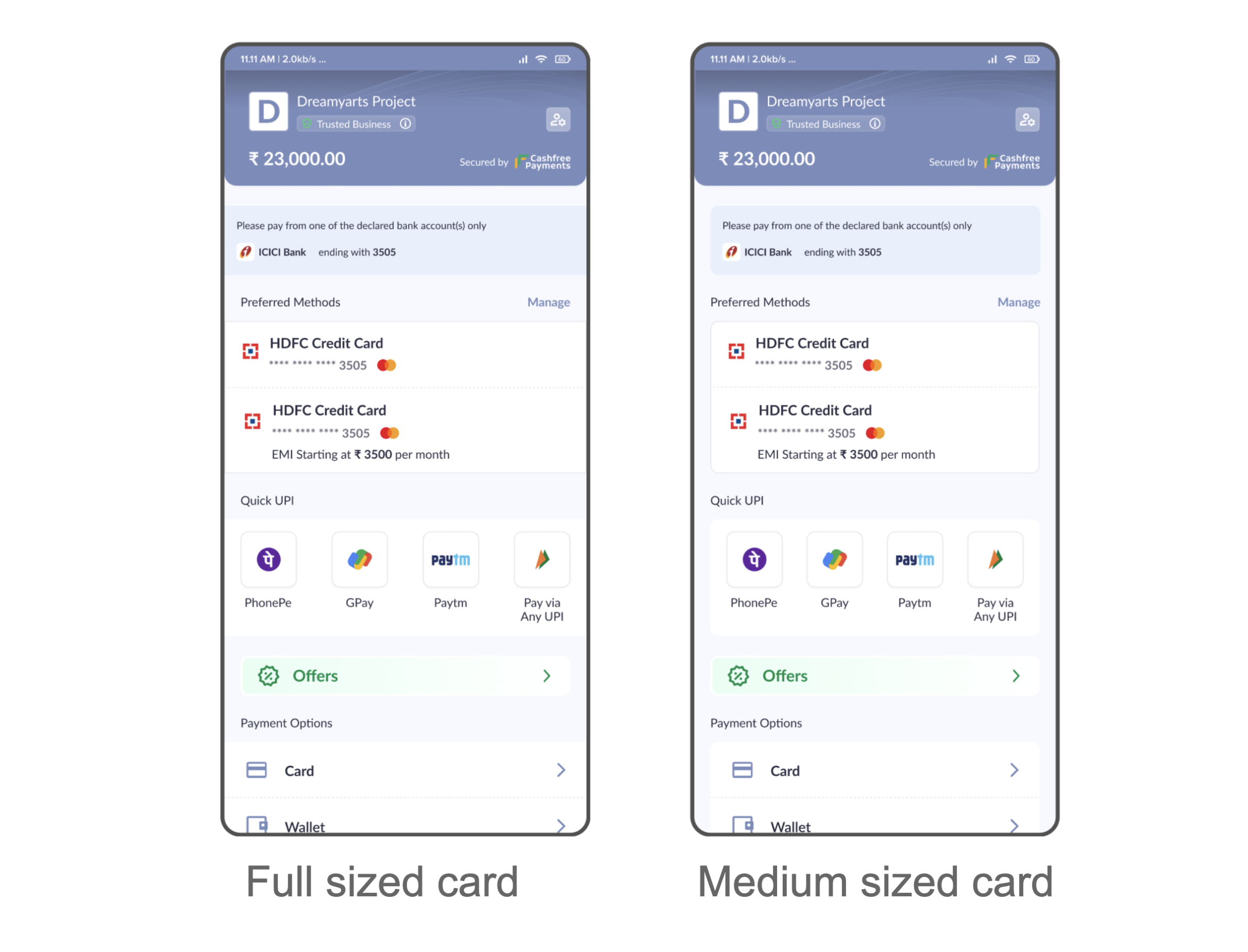
- Card style - full or medium sized
- Card colour
- Card border colour
- Card corner radius
- Primary text colour
- Secondary text colour
- Tertiary text colour
Layout and Typography
Card Style
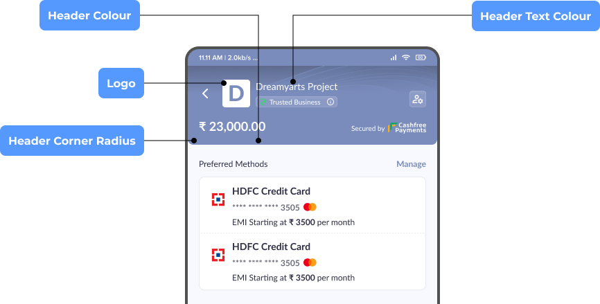
Header
You can configure the following options:
- Header colour
- Header text colour
- Header corner radius
- Logo
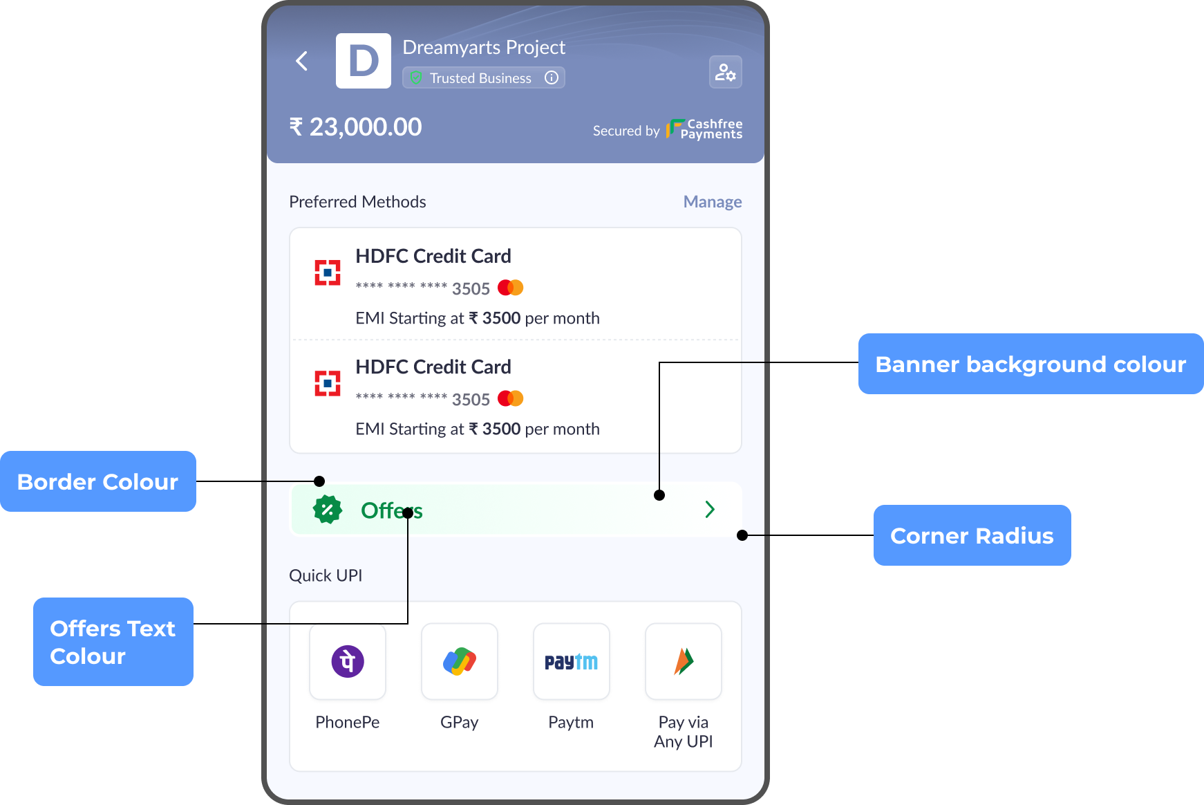
Offers Banner
You can configure the following options:
- Offer banner style - card width or full width
- Banner background colour
- Banner border colour
- Banner corner radius
- Offers text colour
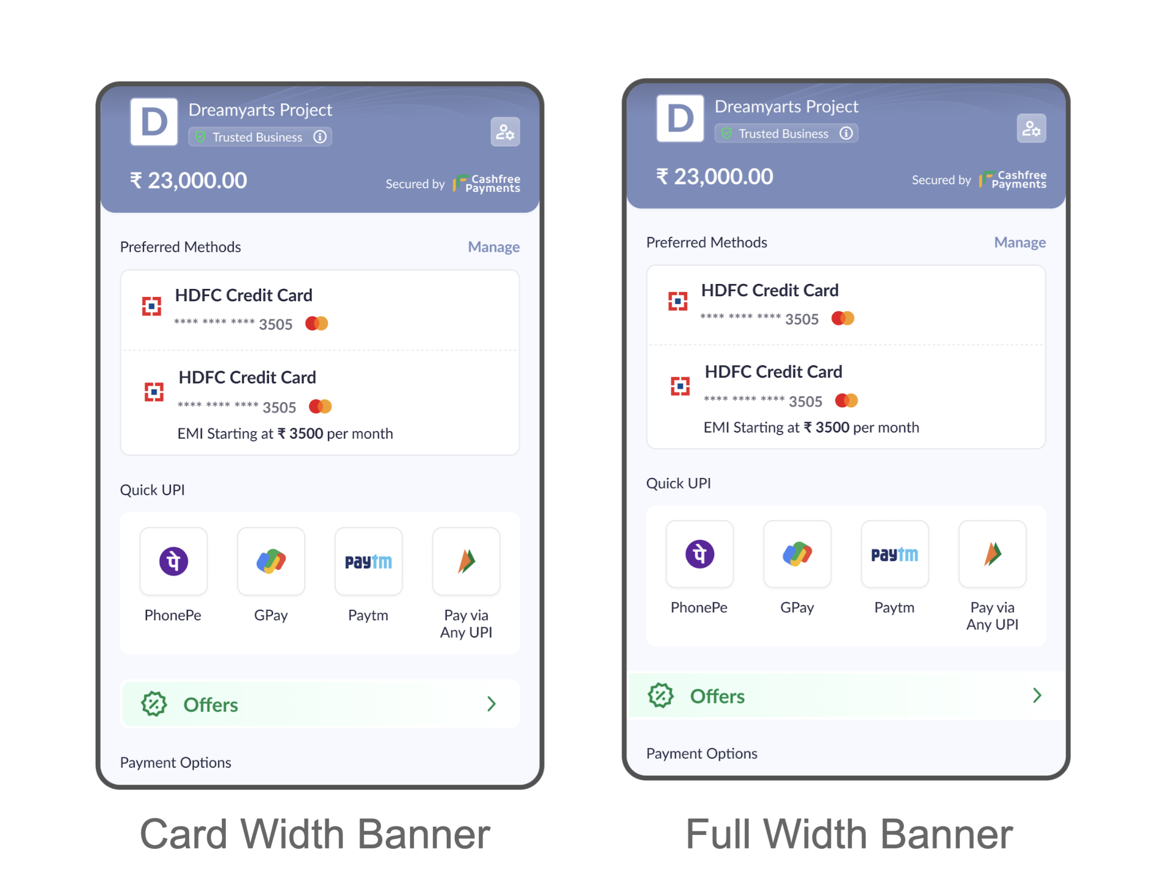
Offer Banner Style
Input Fields
You can configure the following options:
- Input field style - underlined or enclosed
- Field corner radius
- Field background colour
- Field border colour
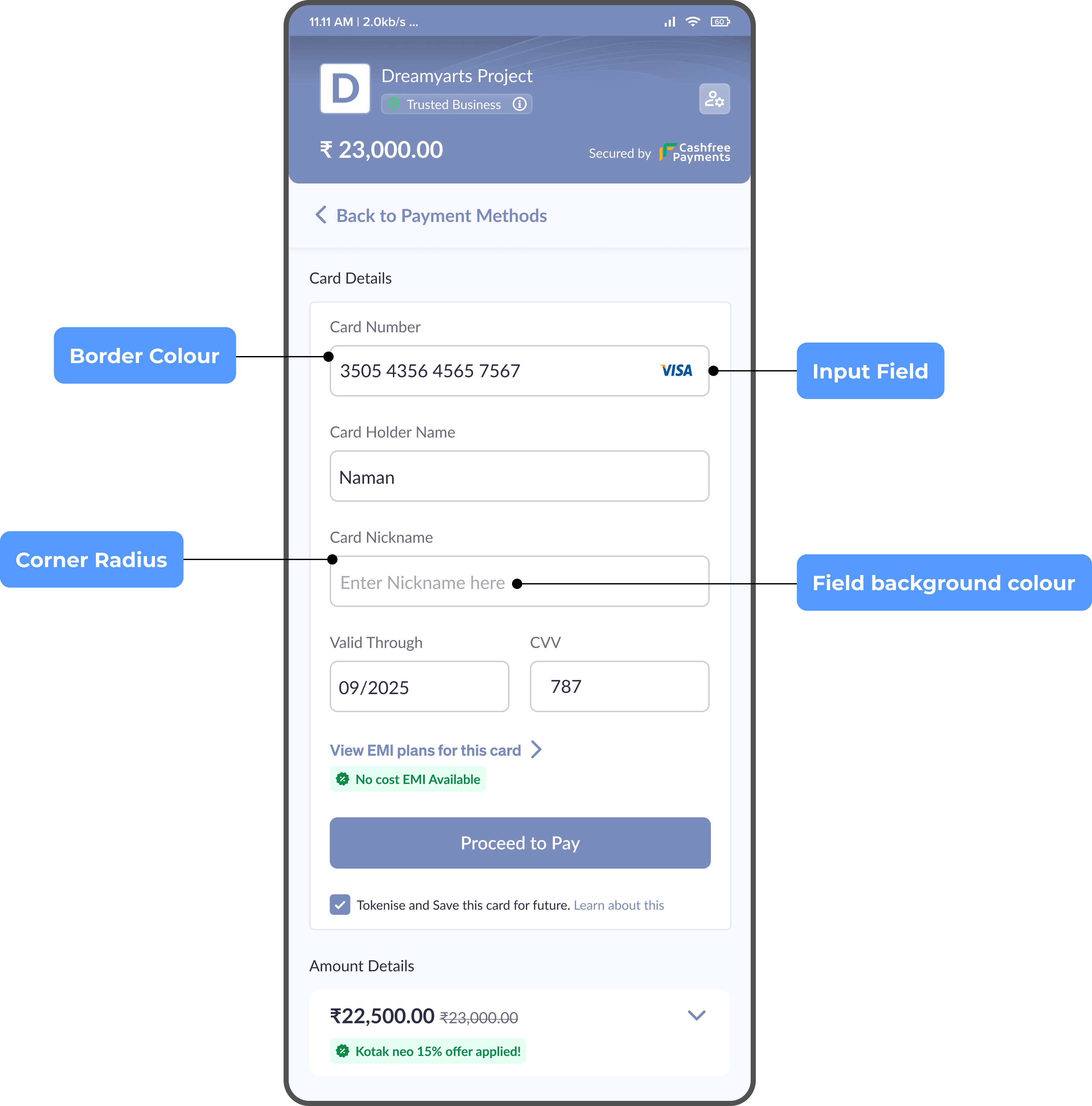
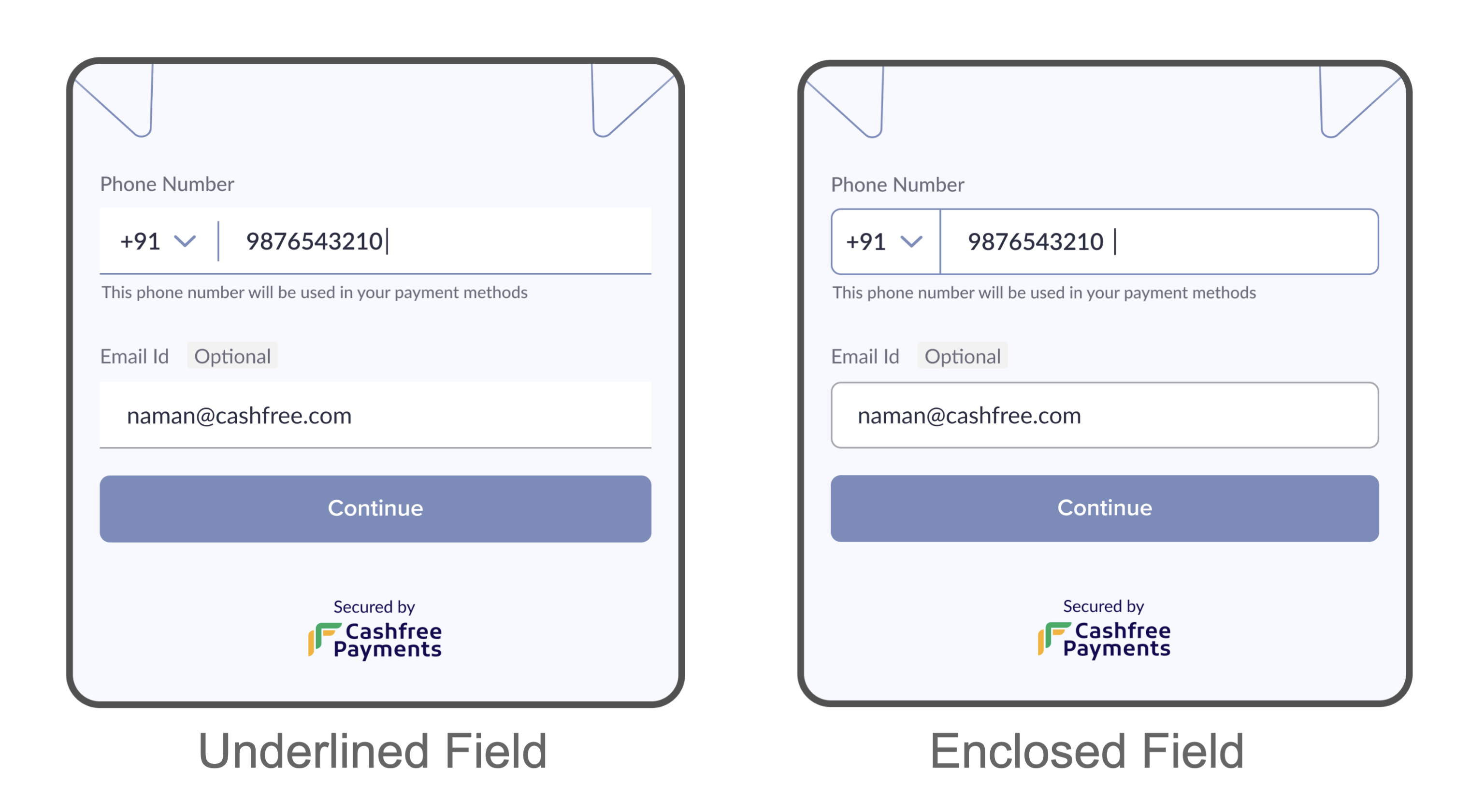
Input Field Style
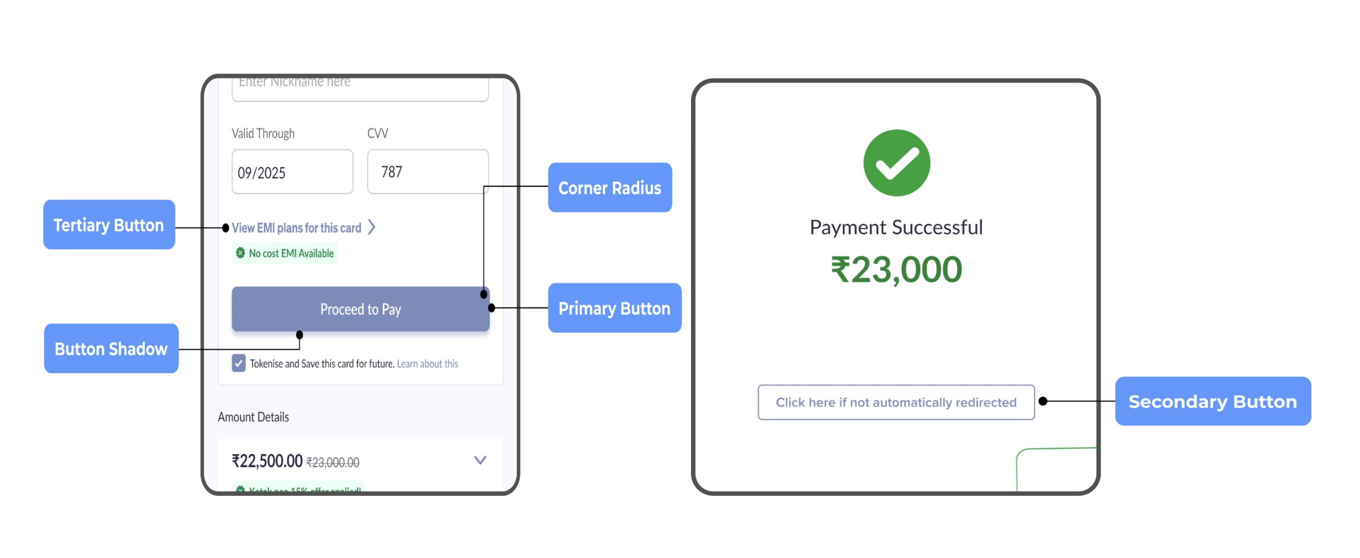
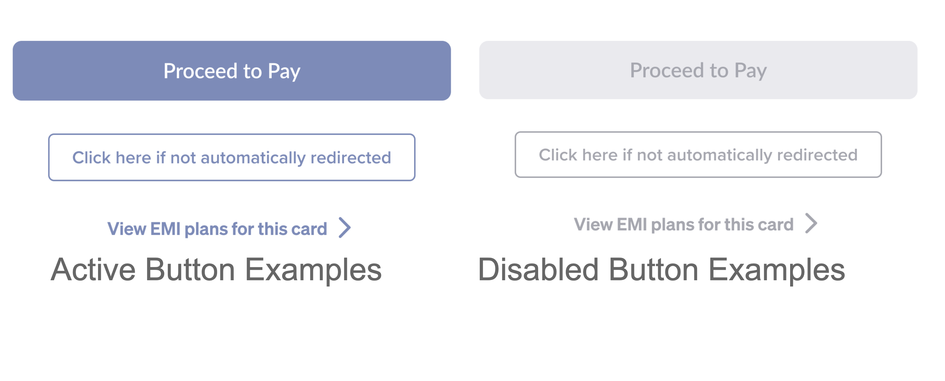
Buttons
You can configure the following options:
-
Primary button
Button Type Configuration Active Button colour, text colour Disabled Button colour, text colour -
Secondary button
Button Type Configuration Active Border colour, text colour Disabled Border colour, text colour -
Tertiary button
Button Type Configuration Active Text colour Disabled Text colour -
Button shadow
-
Button corner radius
Button Type
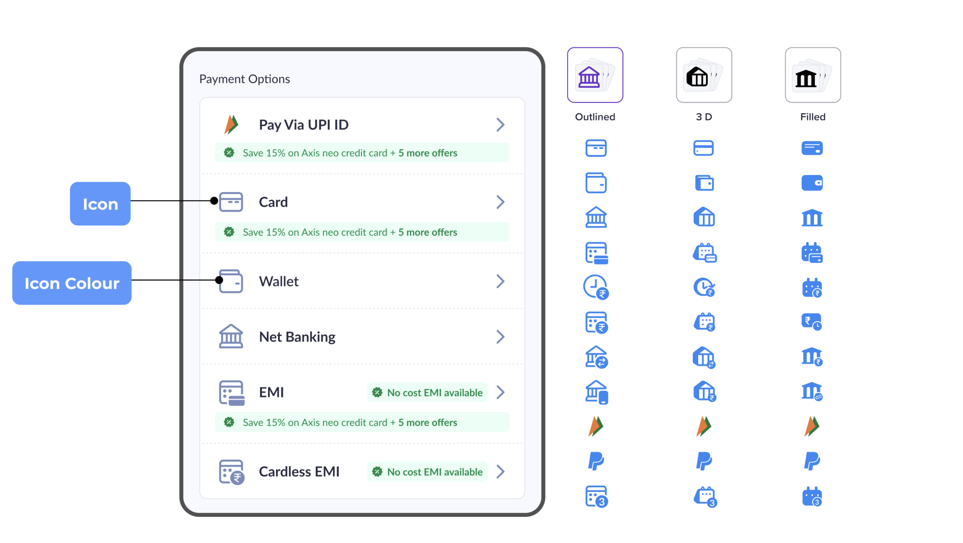
Icons
You can configure the following options:
- Icon style
- Icon colour
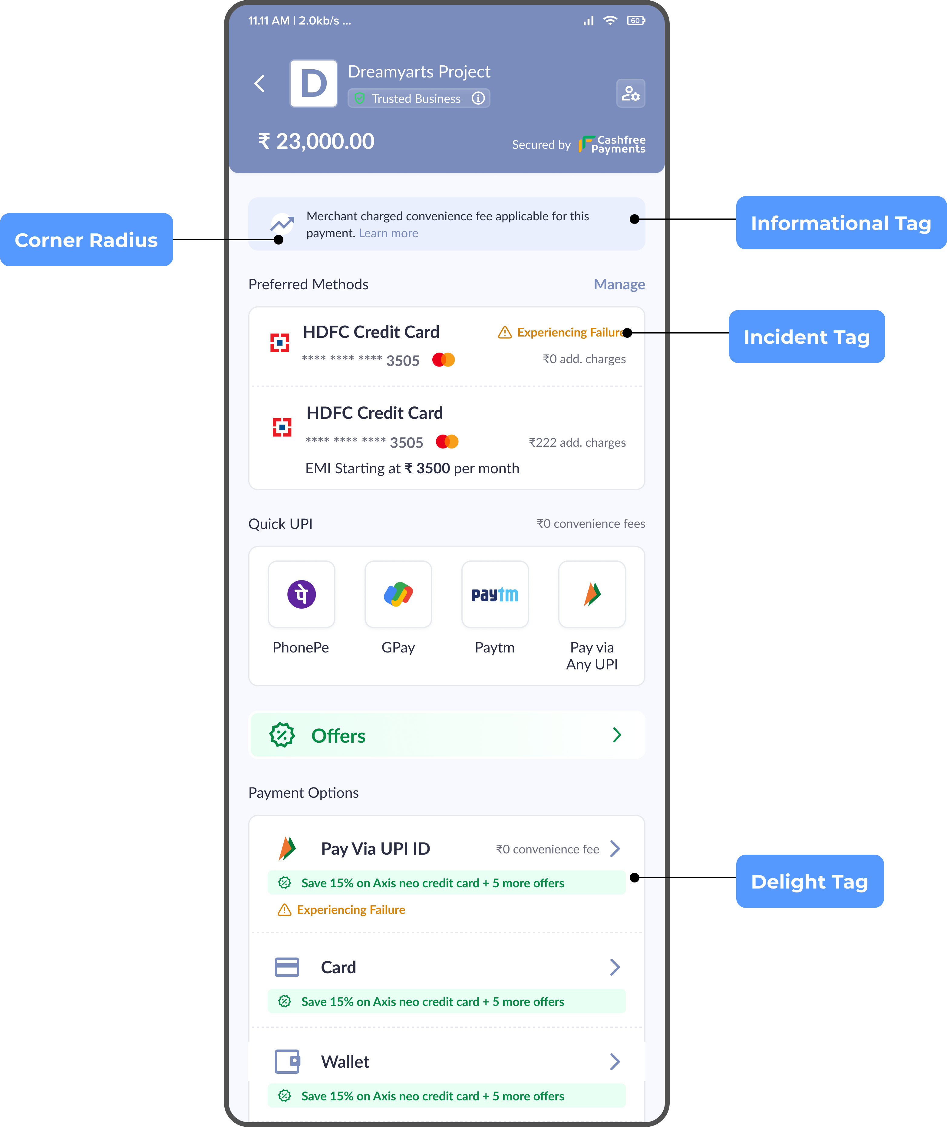
Tags
You can configure the following options:
- Incident tag - background colour, text colour
- Delight tag - background colour, text colour
- Informational tag - background colour, text colour
- Tag corner radius
Terminal State
You can configure the following options:
- Failure colour
- Success colour
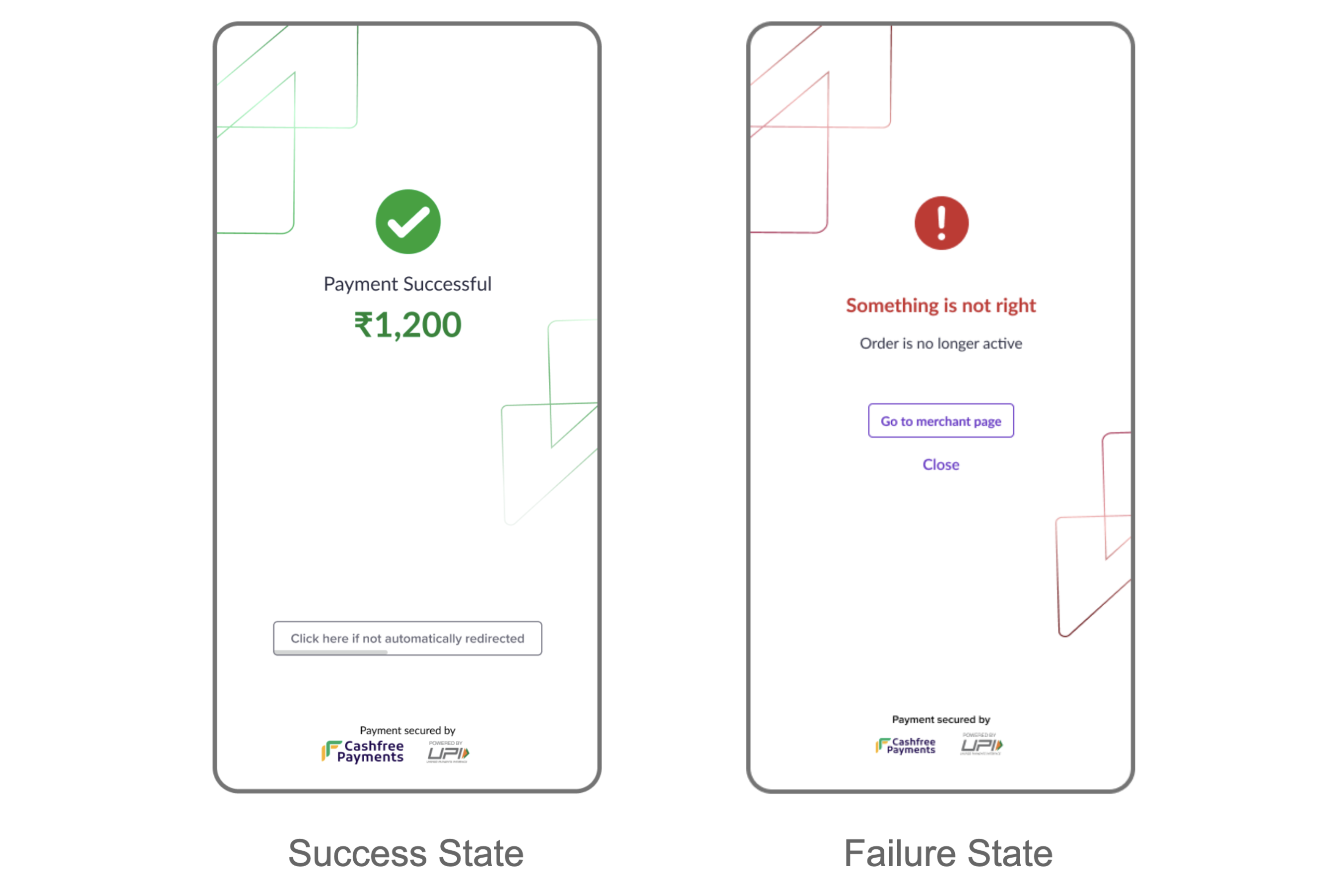
Terminal States
Subscribe to Developer Updates
Updated 5 months ago